PACKAGING
Spinkas
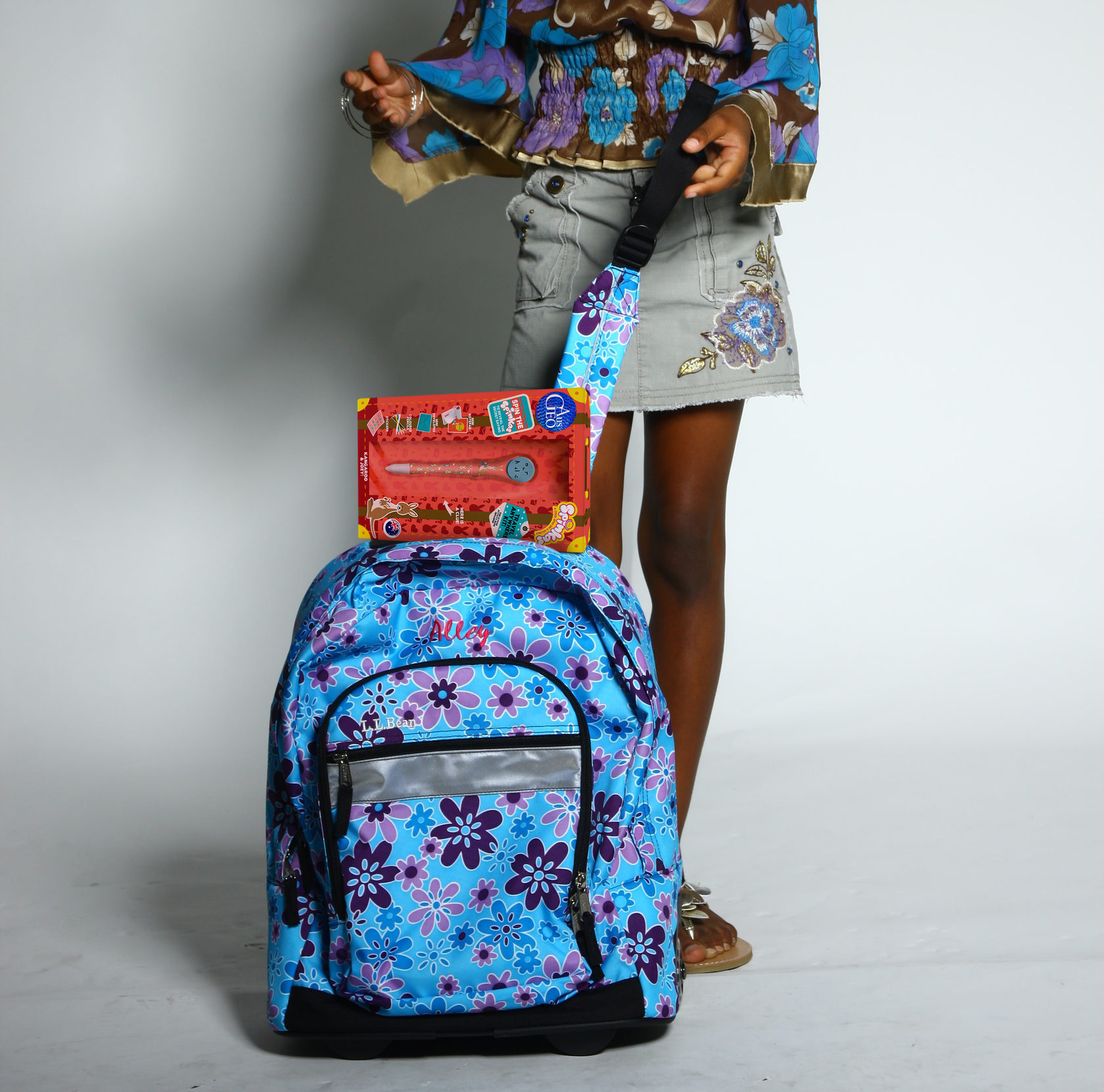
Re-packaging for stationary travel kit of Spinkas pens.
As Australian Geo partnered up with Spinkas to sell their stationary sets, they needed a packaging redesign to fit their own brand identity.
As Australian Geo partnered up with Spinkas to sell their stationary sets, they needed a packaging redesign to fit their own brand identity.
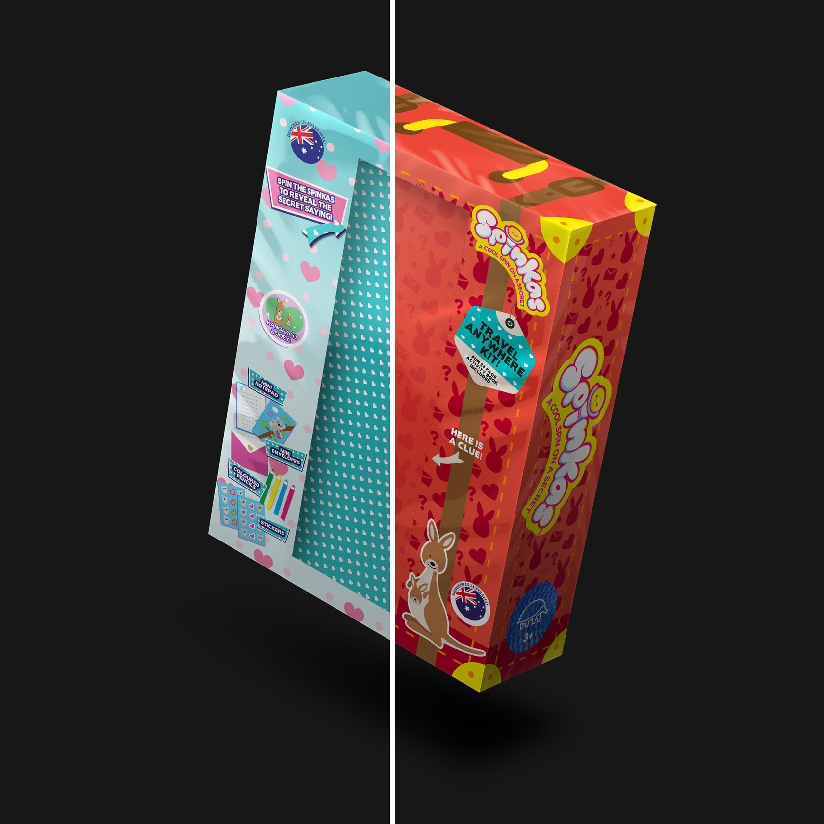

The existing package of Spinkas sets were heavily oriented towards girls, with a raw blue as the main color of the box. According to the brand identity of Australian Geo; I didn't want to position the design closer to any gender, and chose warm, earthy red colors in line with the Australian climate to achieve a unisex look.
The inspiration
The Spinkas kits are called "travel sets" as they include all essentials so that children can write letters to their friends while travelling. I envisioned the box as a little suitcase, with the kids taking them wherever they go! I was definitely inspired by classic leather luggages with print, and wanted to put a spin on them with a unique pattern.

The Concept
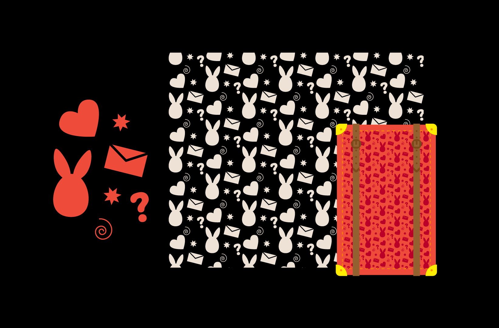
I created a seamless custom pattern and applied it to the box's background; along with details of straps , stitches and suitcase corners. The pattern was also used in the inner sleeve of the box.
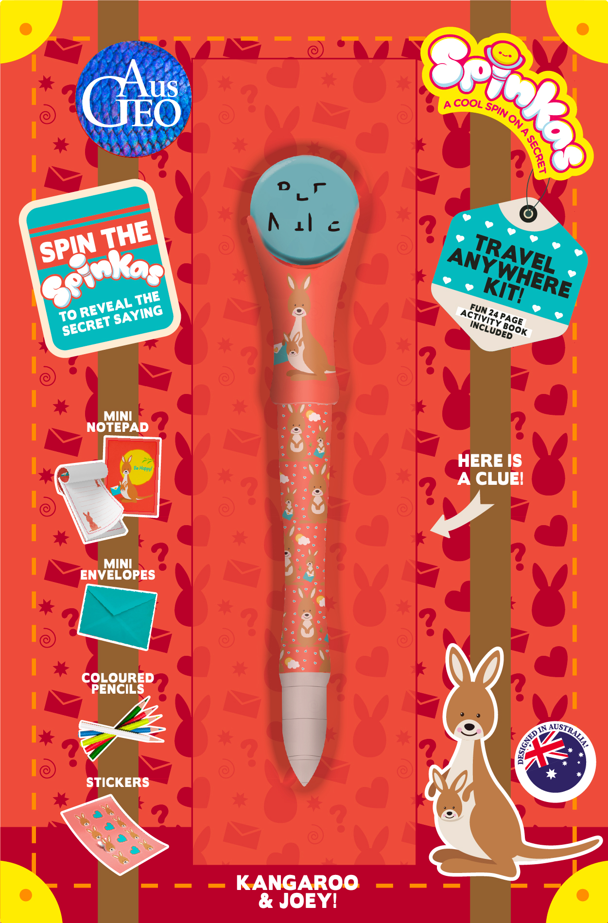
All items on the box are also themed aroundtravel!
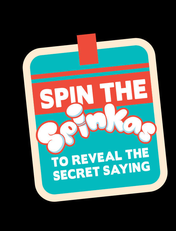
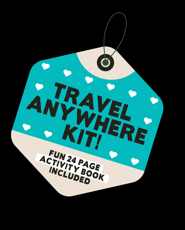
I’ve designed the information badges to look like tags & stickers as a luggage would have.
I’ve designed the information badges to look like tags & stickers as a luggage would have.
Contents

Redesign of contents' images (notepad, envelope and stickers)
Result